
AssembleDebug / Android Authority
TL;DR
- With this week’s release of Android 16 QPR3 Beta 2, there’s a new way to resize home screen widgets.
- Instead of just dragging edges to resize, QPR3 adds some new plus/minus buttons.
- The new resizing buttons follow Android system theme colors.
Earlier this week, Google brought Pixel users on its testing track a treat with the release of Android 16 QPR3 Beta 2. Ever since, we’ve been keeping an eye out for all the changes and fixes it delivers — and now we just spotted another one.
Don’t want to miss the best from Android Authority?
Widgets in Android are a fantastic way to add some extra functionality to your home screen — and there are lots of great ones to choose from. Beyond having our pick of where we place widgets, many of them are also resizable. Playing with your options there has been reasonably straightforward so far: Press and hold on a widget to reposition it, and then once it’s placed where you like it, drag the edges to resize.
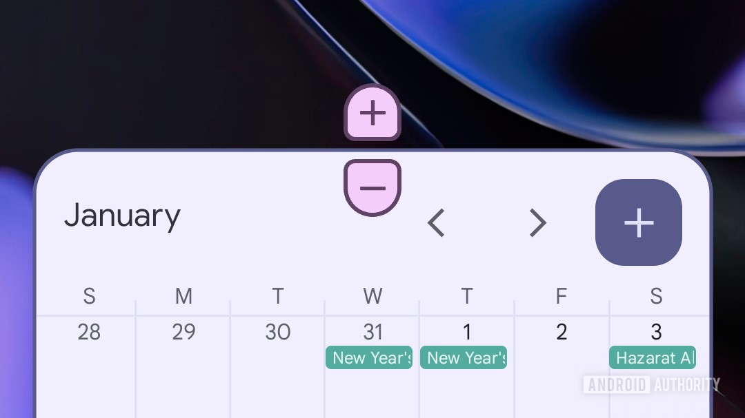
With QPR3 Beta 2, however, users are being introduced to a slightly different interface here. Instead of resizing widgets solely by dragging around the anchor points on their edges, Android is implementing a new pair of plus and minus buttons:
While that still leaves us with the same size options as before, we can see how this might be an improvement from an accessibility standpoint, especially for users who might struggle with fine motor control — rather than dragging just the right distance and releasing at the perfect time, you can achieve the same results with a few taps.
Another benefit of this new interaction is that it’s finally clear when you’ve reached the widget’s limits — when you can’t make it any larger or smaller, you’ll no longer see the button for that option presented. And as you can see in the demo above, the buttons work in both horizontal and vertical directions.
Like many widgets themselves, we see these new resizing buttons pick up their color palette from your system theme, and while we admit they still look a bit weird to our eyes, at least the colors are right!
As with any Beta feature, Google could very well change exactly how this looks and works prior to the stable release — assuming it even sticks around. We’ll check in with those future builds and let you know if we spot any further movement with these new controls.
Thank you for being part of our community. Read our Comment Policy before posting.
 By
By