Paul Jones / Android Authority
One UI changed the game when it was released toward the end of 2018. Gone was the sluggish, bloated Android skin that Samsung users were used to up to that point. Aside from performance, One UI focused on one-handed use when it was released, which is how it earned its name.
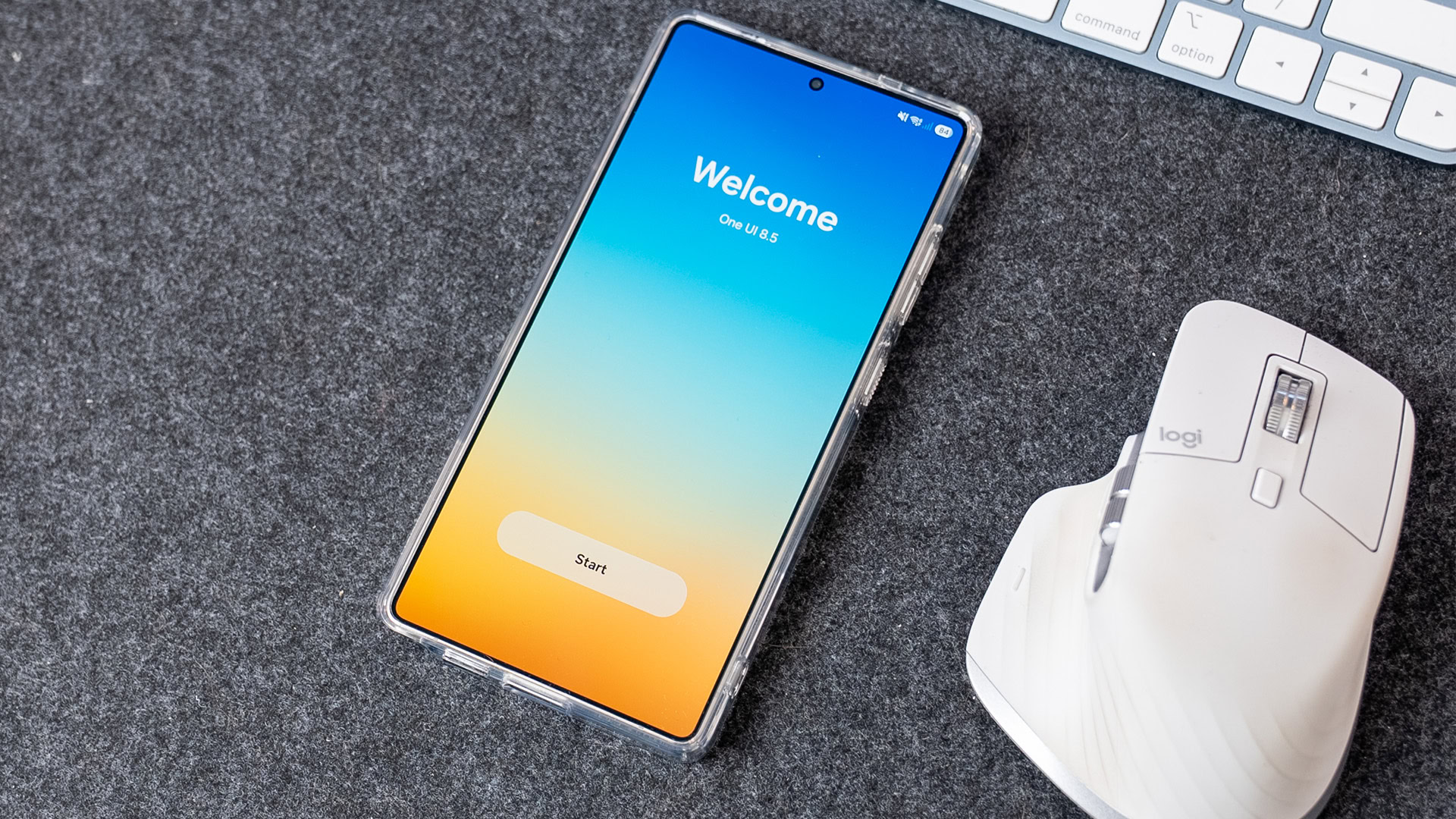
But over seven years later, the focus on one-handed use feels like an afterthought, especially with the latest One UI 8.5 beta.
Do you wish One UI was easier to use one-handed?
0 votes
What made One UI different?
We’re so used to One UI now that it can be hard to remember what made it so different in the first place. The big thing One UI did was what I would describe as over-scrolling.
Open a Samsung app, like Settings, and scroll to the top. You can pull the top items in the list of menus down towards the middle of the screen, something older versions of Samsung’s software, and indeed modern Android skins that compete with One UI, lack. One UI also moved many of the menus and buttons that once lived at the top of the screen to the bottom, within reach of your thumb. You can see examples of this in the screenshots above, which are from the One UI beta for the Galaxy S9.
The work Samsung put into one-handed has paid off. Phones were already big when One UI launched, and they’ve only gotten bigger since then. As good as One UI is, there were still UI elements that were hard to reach. It’s as if Samsung got 95% of the way there and then stopped. We’re on the 8th major release of One UI now, and while it hasn’t gotten any worse, it hasn’t gotten any better, either.
One UI 8.5, which is currently in beta, makes some small changes, but not enough.
One UI 8.5 makes one small improvement, but it isn’t enough
So, what has One UI 8.5 done to improve one-handed use? Not much. The settings app has moved the search button from the top right (pictured left) to a bar at the bottom of the screen (pictured right). When I saw the settings app redesign, I was hopeful that Samsung would do the same with all its apps, but it hasn’t. Every other Samsung app keeps the search button where it’s always been.
The most likely reason for this is that the bottom of Samsung’s other apps already has UI elements there. However, I don’t think that’s a valid excuse. Look at apps like the dialer, calendar, or gallery, and the bottom row of icons has plenty of space for a search bar. The phone app currently has only the keyboard, recents, and contacts in its taskbar, while the calendar app has its entire bottom bar dedicated to event creation.
There’s more than enough space to move the search button and other UI elements down here, and it’s frustrating that it hasn’t happened. Having a core UI element like search appear in different places and in different forms across apps is inconsistent and makes it harder to build muscle memory.
Aside from that, there’s another change I’d like Samsung to make. As I said earlier, One UI is already so close to being perfect for one-handed use, so the changes I’d like Samsung to make may seem small and insignificant, but it’s the little things that can make the biggest difference.
The first thing I’d change is the position of the edit, power, and settings buttons in the Quick Settings. While Google’s Quick Settings (pictured left) has its own issues, namely the brightness slider being stuck at the top, it does get one thing right: the position of the settings and power menu buttons, placing them in the bottom right. One UI (pictured right), meanwhile, places them at the top, where it’s harder to reach.
If Samsung had already gone to the effort of letting users move everything else, why not these buttons?
What makes this all the more frustrating is that Samsung just reengineered the Quick Settings panel to be more customizable than ever before. Toggles can be resized, sliders can be made vertical, and it’s generally the best Quick Settings layout Samsung has made. You can’t move the buttons for editing the panel, opening settings, or accessing the power menu, however. If Samsung had already gone to the effort of letting users move everything else, why not these buttons?
Phones are only getting bigger, so focusing on making the software easier to use with one hand has never been more important. Samsung cared enough to name its entire software skin after that very feature, but since then, it’s fallen by the wayside, and I’d like to see that change.
What about you? Do you wish One UI, or other Android skins, were easier to use with one hand? Let us know.
Don’t want to miss the best from Android Authority?


Thank you for being part of our community. Read our Comment Policy before posting.
