Kaitlyn Cimino / Android Authority
I love a fresh watch face, and would even say it’s one of my favorite aspects of wearing a smartwatch. It’s the fastest way to make a device feel new again, and on the Google Pixel Watch 4, the right watch face can completely change the vibe from workout-ready to weekend casual. While there’s no shortage of paid options in the Play Store, I’m a firm believer that you don’t need to spend extra to get something great. After cycling through more designs than I care to admit, I narrowed things down to five free Pixel Watch 4 faces that I keep on deck.
Retro Analog
Kaitlyn Cimino / Android Authority
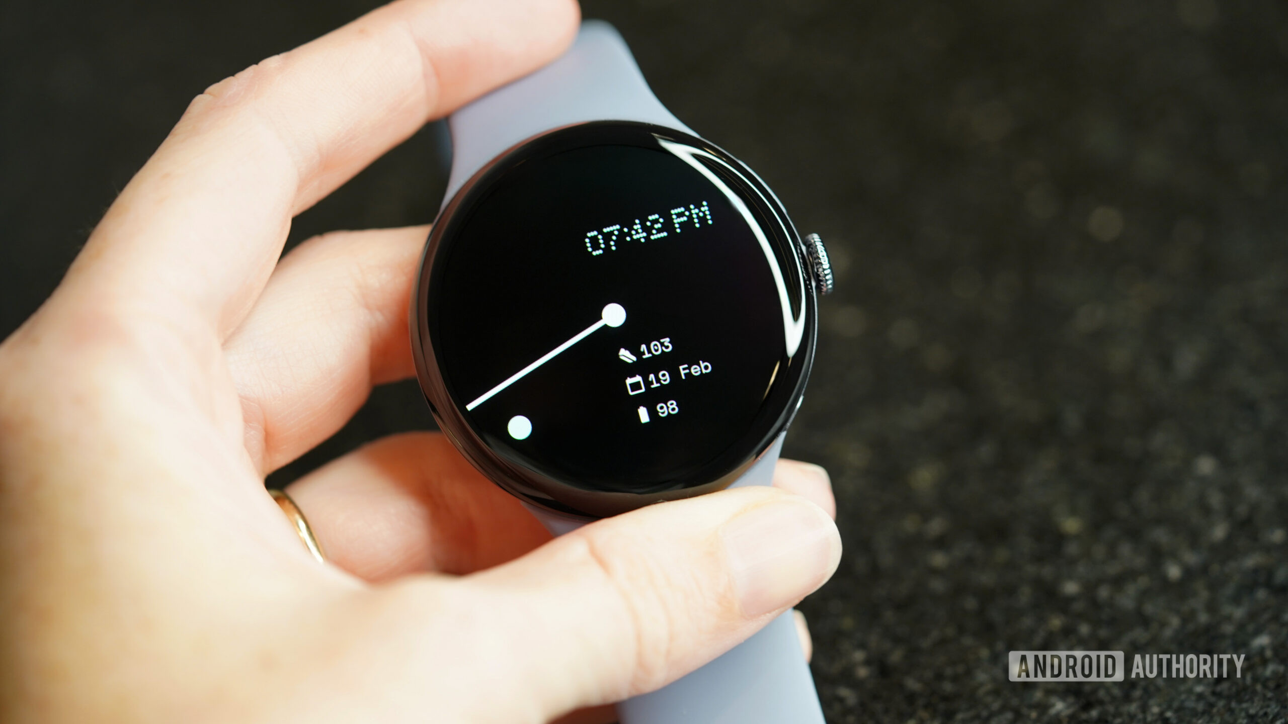
Retro Analog (CMF Analog) by Sparkine Labs is currently my daily driver and one of the faces I return to most. The design is intentionally pared back, with a muted retro color palette, slim hands, and subtle complications that keep the dial clean without feeling sparse. On the wrist, it lands somewhere between a vintage field watch and an understated smartwatch. Personally, it gives low-key spy gadget energy, like loading into a round of 007 on N64 (the closest I’ll ever get to being a real secret agent).
When I want to feel like a secret agent, this retro analog look delivers.
What keeps it in my rotation is how calm it feels. Two core styles, dozens of curated color themes, and three complication slots provide flexibility without inviting endless tweaking, and the Watch Face Format foundation helps everything run smoothly. I swapped heart rate in for step count as my top complication, but kept the default date and battery indicators. When I have something exciting on my calendar, I trade one of the three for a countdown (so I can pretend like I have an upcoming secret mission). Overall, the design won’t grab attention the way novelty faces can, but that’s the appeal. It’s a face that feels timeless, adaptable, and just a little cinematic.
Concentric
Kaitlyn Cimino / Android Authority
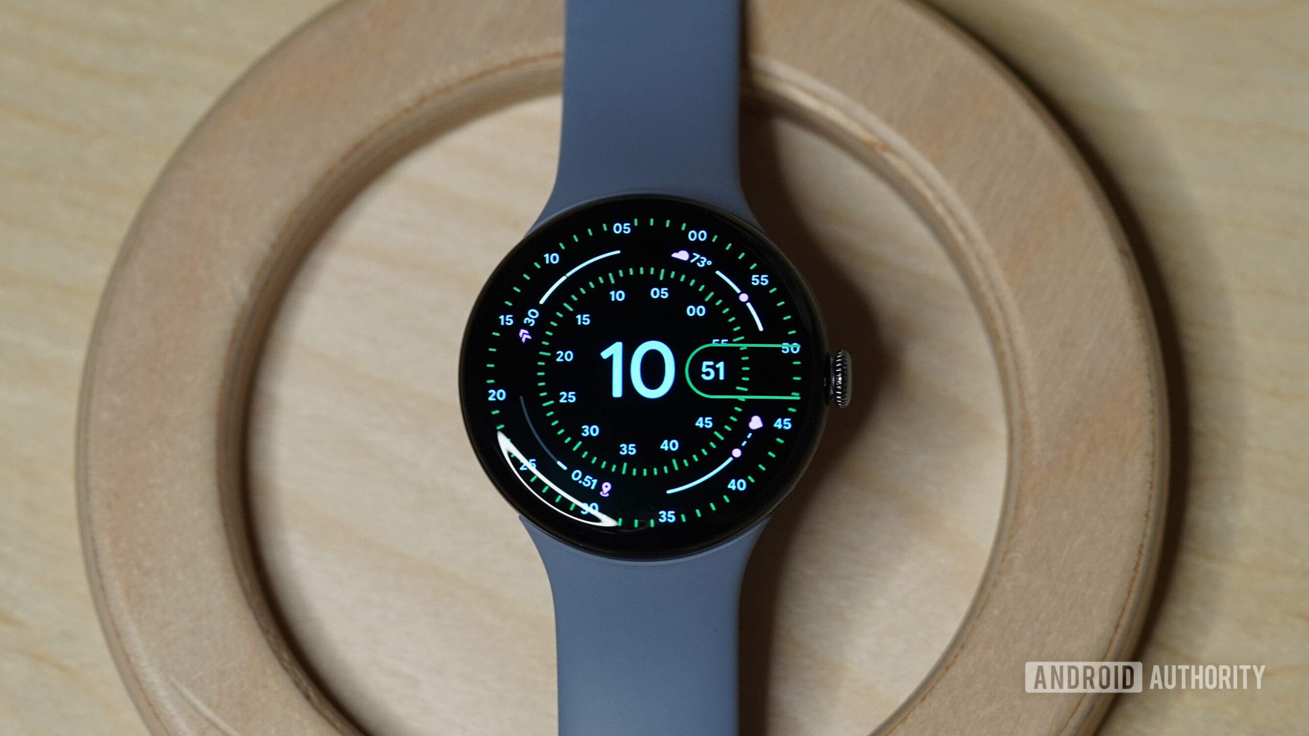
Some developers show up in these lists again and again, and Luka Kilic often earns a spot on mine. Concentric is easily the most elegant pick in my rotation. The balanced design is inspired by the Pixel Watch’s own built-in version, but this third-party option layers rings of information into the look for a more customizable experience. I like to think of it as the native Concentric with the guardrails removed.
Reliably built by a developer I keep coming back to, Concentric is easily my most elegant pick.
A wide range of color themes, index styles, and complication options lets me tailor the look without disrupting the symmetry. Meanwhile, AOD support and intentional spacing keep details readable. It won’t be the pick for someone chasing novelty, but in a rotation full of personality and performance faces, Concentric is the one I choose when I want something useful but also beautiful.
Sports Watch Face 019
Kaitlyn Cimino / Android Authority
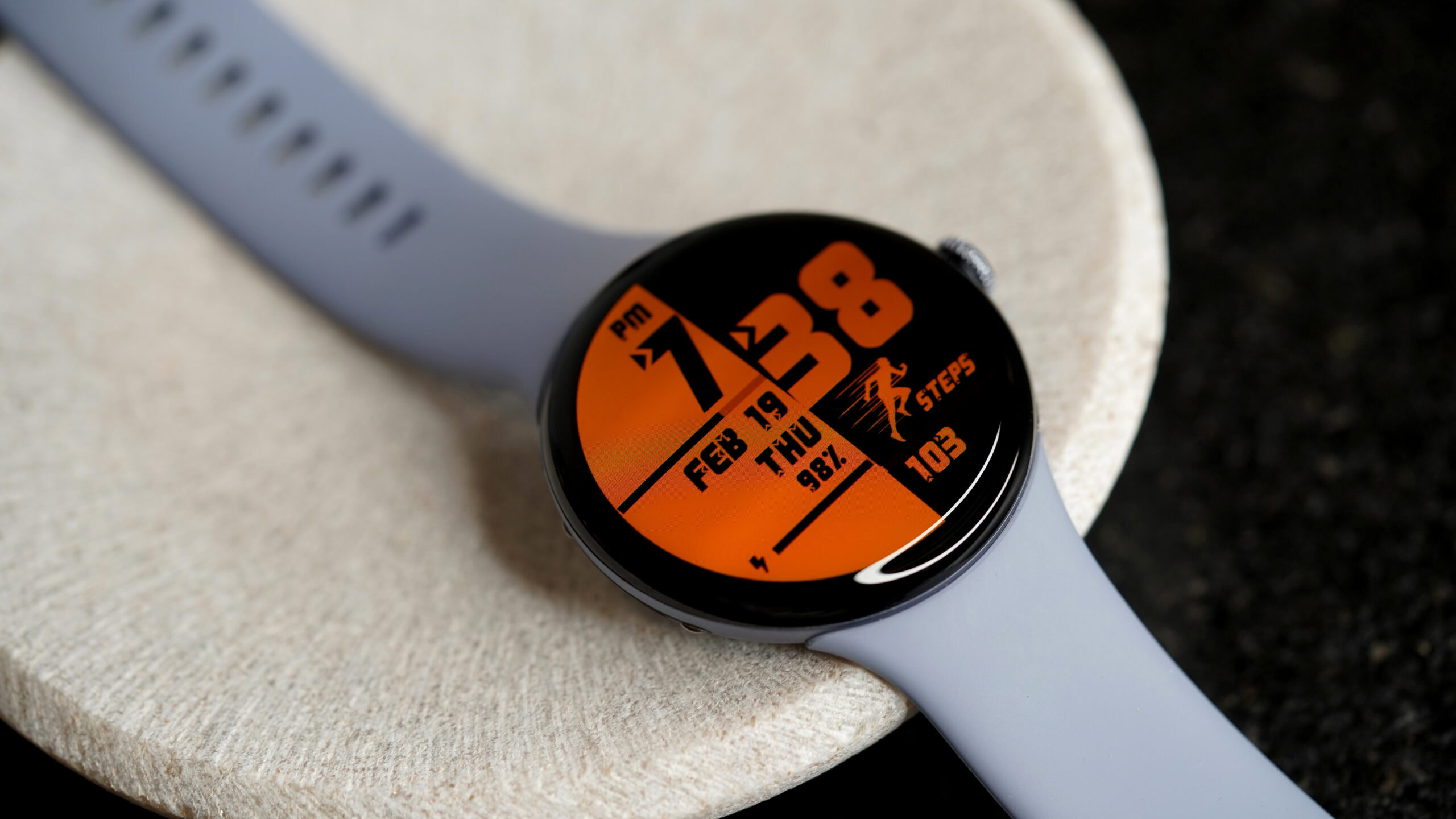
The name doesn’t leave much to the imagination, but Sports Watch Face 019 by Lihtnes Watch Faces is the face I default to when I’m headed to the gym (or trying to convince myself to get there). It leans into a classic digital training aesthetic with clean metrics, segmented progress bars, and just enough color to stay interesting without muddying the data. I picked the obnoxious orange, but there’s a wide range of vibrant themes depending on your tolerance for visual motivation.
As the name implies, Sport Watch Face is my top choice for a good fitness companion.
The utilitarian layout centers the numbers I actually check, while visual goal markers like a 10K step indicator make progress feel concrete instead of theoretical. It’s practical, reliable, and exactly what I want when I’m trying not to lose momentum. Four customizable complication slots let me shift the focus from heart rate to timers to recovery stats depending on the day, all while keeping everything quick to read at a glance.
Don’t want to miss the best from Android Authority?


Pop Time
Kaitlyn Cimino / Android Authority
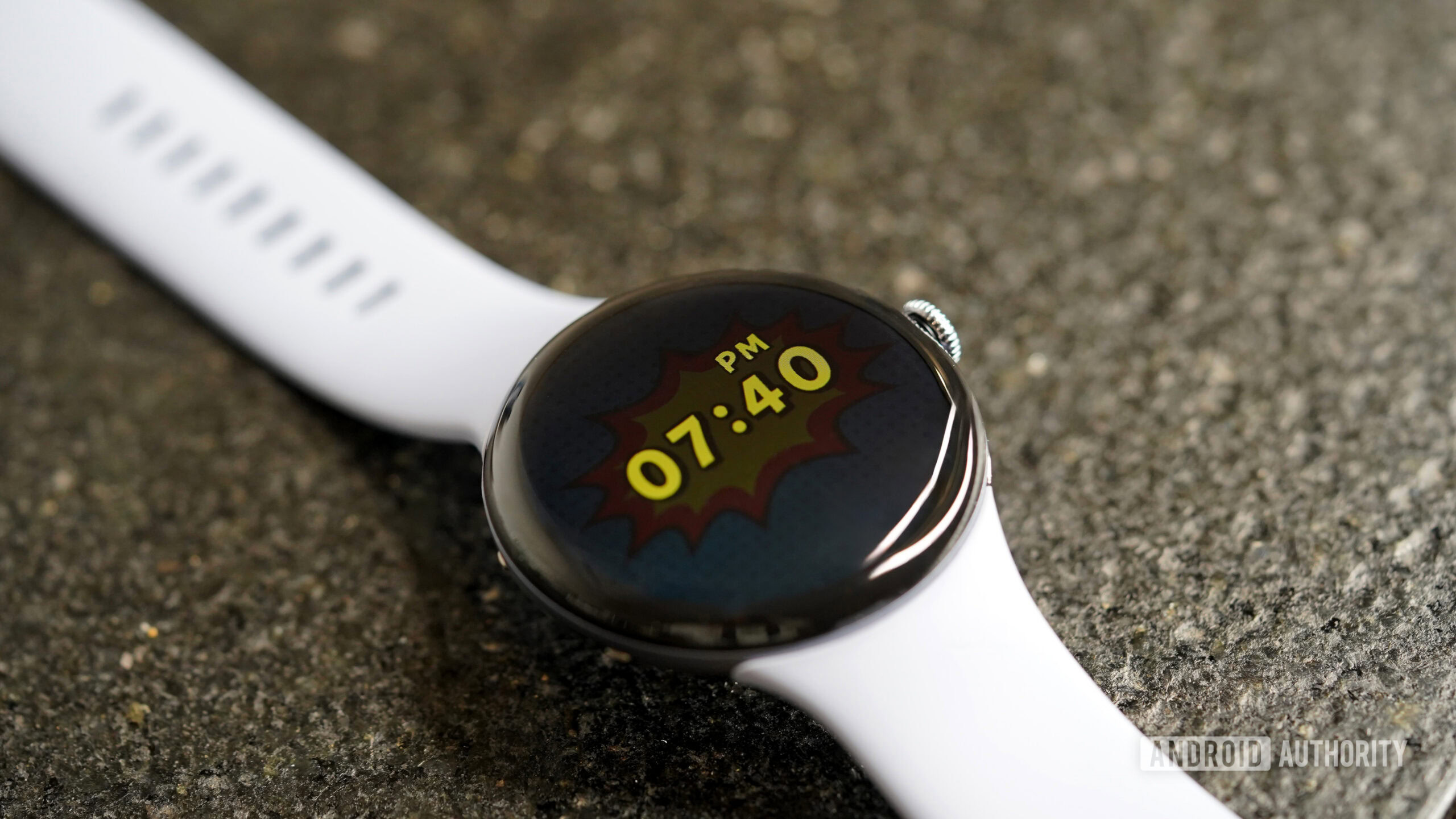
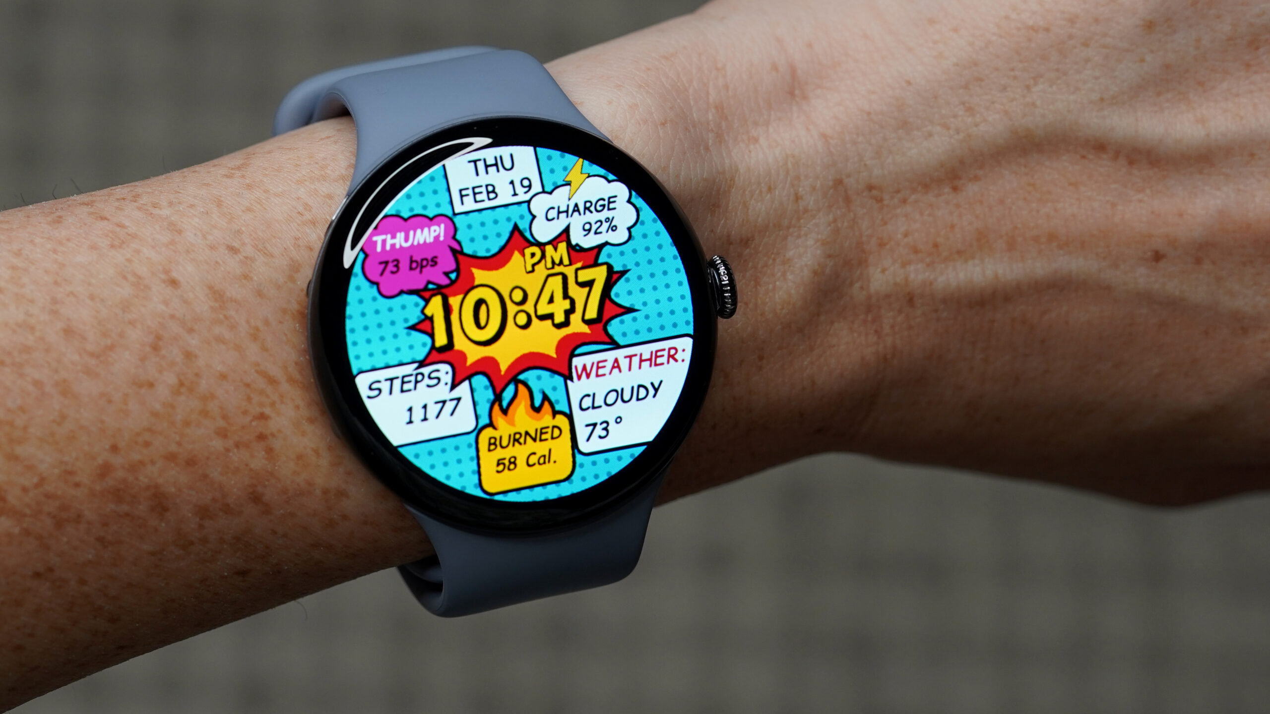
Another aptly named design, POP Time by Time Design LLC feels like it was pulled straight out of pop-art comics, with classically saturated colors, bold dots, and speech bubbles. Personally, it reminds me of watching Batman cartoons with my dad: high energy and too corny not to love. It’s playful, nostalgic, and stands out in my carousel of favorites.
Pop Time looks straight out of a comic book, which makes it both nostalgic and upbeat.
The punchy look also doesn’t derail usability. Though it isn’t customizable, preset data points include time, date, steps, heart rate, battery, and weather, each inside high-contrast panels that are very readable. The structured grid prevents the layout from getting too overwhelming (no small feat when your watch looks like it’s mid sound effect). Always-on (AOD) support keeps the comic styling intact, simplified down to the time in a single bubble.
Fishcat
Kaitlyn Cimino / Android Authority
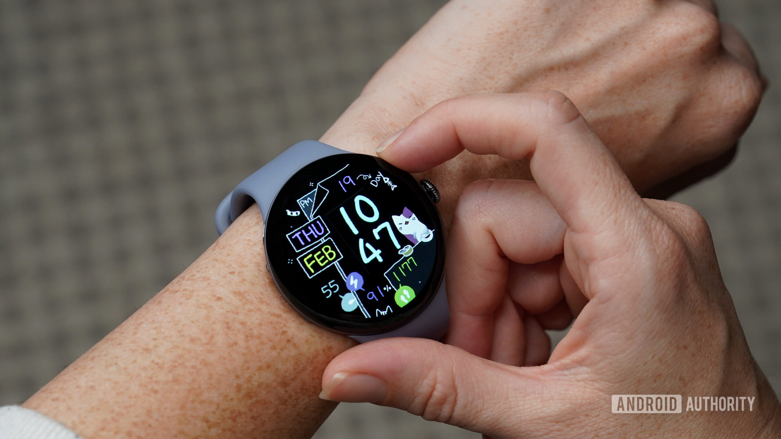
I’m not sure there’s a bad day that can’t be at least moderately improved by an animated cat and a wiggly fishbone. Fishcat by artisan gives it a shot with a design that balances personality with practicality, pairing simple, looping animation with a tidy digital layout. Though not customizable in terms of complications, the design surfaces all the essentials, including time, date, battery, and daily steps. There’s also an itty-bitty second-hand dial that adds to the chaotic charm. Custom color options range from pastel-pep to slightly more understated, while the overall layout stays readable and fun.
It’s hard to beat the charm of an animated cartoon cat.
It’s not the most data-heavy option, but sometimes I need a break from overload anyway (and apparently an equal break from mature aesthetics). In AOD mode, the animations pause, but the info and characters are still faintly visible. If your rotation could use something cheerful, this heartwarming face is worth considering.
Honorable mentions
In reality, narrowing this list down to just five was a lot easier said than done. Below are a two more worth considering.
- Candy Time is another pick by Time Design LLC, but this one looks like it’s been doodled onto your wrist with Sharpie, pairing bright candy colors with a chunky digital layout that’s easy to read at a glance.
- Embassy is a very basic option for minimalists. It pairs a clean digital layout with subtle color options that make for a professional but personalized look.
Thank you for being part of our community. Read our Comment Policy before posting.
