
Mishaal Rahman / Android Authority
TL;DR
- Google Contacts is prepping a new layout for contact profile pages.
- More info is being moved up top for easy at-a-glance access.
- We could lose the “About” section for a dedicated “Notes” view.
Google Contacts is definitely one of the company’s most under-appreciated Android apps, but for the easily overlooked, all too utilitarian role it often plays, it’s still been getting a solid amount of attention from developers over the past year. That’s brought it some nice new features like Calling Cards, and work’s actively underway to make those even better. Today we’re checking out another corner of Contacts that’s due an update, as Google tries out a new look for profile pages.
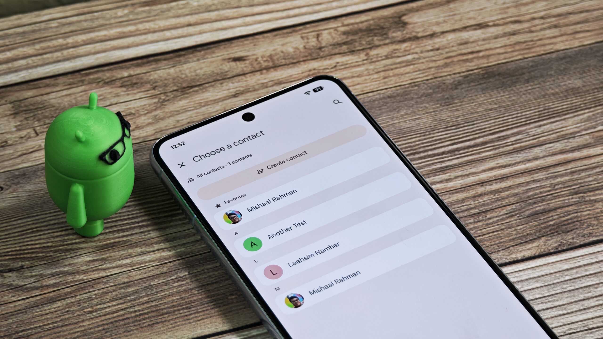
Right now, Contacts has a small bloat problem. When we were just saving names and email addresses, it was easy enough to nicely display everything, but your modern Contacts profile has quite a bit more data to include. Here’s how that looks today:
That gets the job done, admittedly, but it’s also a bit sprawling. Could there be a better way to organize things?
Don’t want to miss the best from Android Authority?
Well, in Contacts version 4.75.27.882333999, we’ve uncovered an updated layout that starts grouping things together a bit differently. For instance, instead of that separate “Labels” section buried down below, it’s moving prominently up top — kind of like you’d expect a label to be.
Similarly, rather than existing as its own separate thing, now we see the weather forecast for where our contact lives being displayed alongside their location — totally sensible.
Google also appears to be reconsidering its approach to the “About” section here. Instead of having that at all, in this release we see Google preparing to split things up, moving birthday up into the main info block. Then, if you have any notes for a contact, those would start being displayed separately, underneath.
Each of these changes sounds like progress in the right direction to us, and collectively, they show Google working towards keeping Contacts profiles just as info-rich as ever, while striving to make them a bit more optimal, especially at a quick glance.
Right now, none of this is yet visible in the app, but Google could choose to push this new UI live in a future update. We’ll keep an eye out for any further changes.
⚠️ An APK teardown helps predict features that may arrive on a service in the future based on work-in-progress code. However, it is possible that such predicted features may not make it to a public release.
Thank you for being part of our community. Read our Comment Policy before posting.

 By
By