
Stephen Schenck / Android Authority
TL;DR
- The new Google Clock Material 3 Expressive redesign glitches, with jittering digits as the time moves.
- Some layouts are messy under specific settings, forcing scrolling or text wrapping.
- Complaints are piling up on Reddit and Google’s support forum.
Google’s flashy Expressive makeover for the Clock app was supposed to be a simple style update, but plenty of people are unimpressed, to say the least. Across Reddit and Google support forums, people are finding the redesigned app jittery, awkward, and generally a bit of a mess.
Don’t want to miss the best from Android Authority?
On the r/GooglePixel subreddit, one complaint shows the time jittering every second in the World Clock view, with the font resizing and the lower UI shifting around each time the digits change. “It’s so bad it’s funny,” reads the most upvoted response.
It’s a similar story over on r/NothingTech, with another video highlighting the jittery issue on the stopwatch. The variable-width font makes the numbers shift horizontally as they tick up, giving the impression that the whole display is unstable. It’s not exactly ideal when trying to focus on precise timing. Some users said enabling bold text makes it even worse. The video below comes from AleksLevet’s Reddit post.
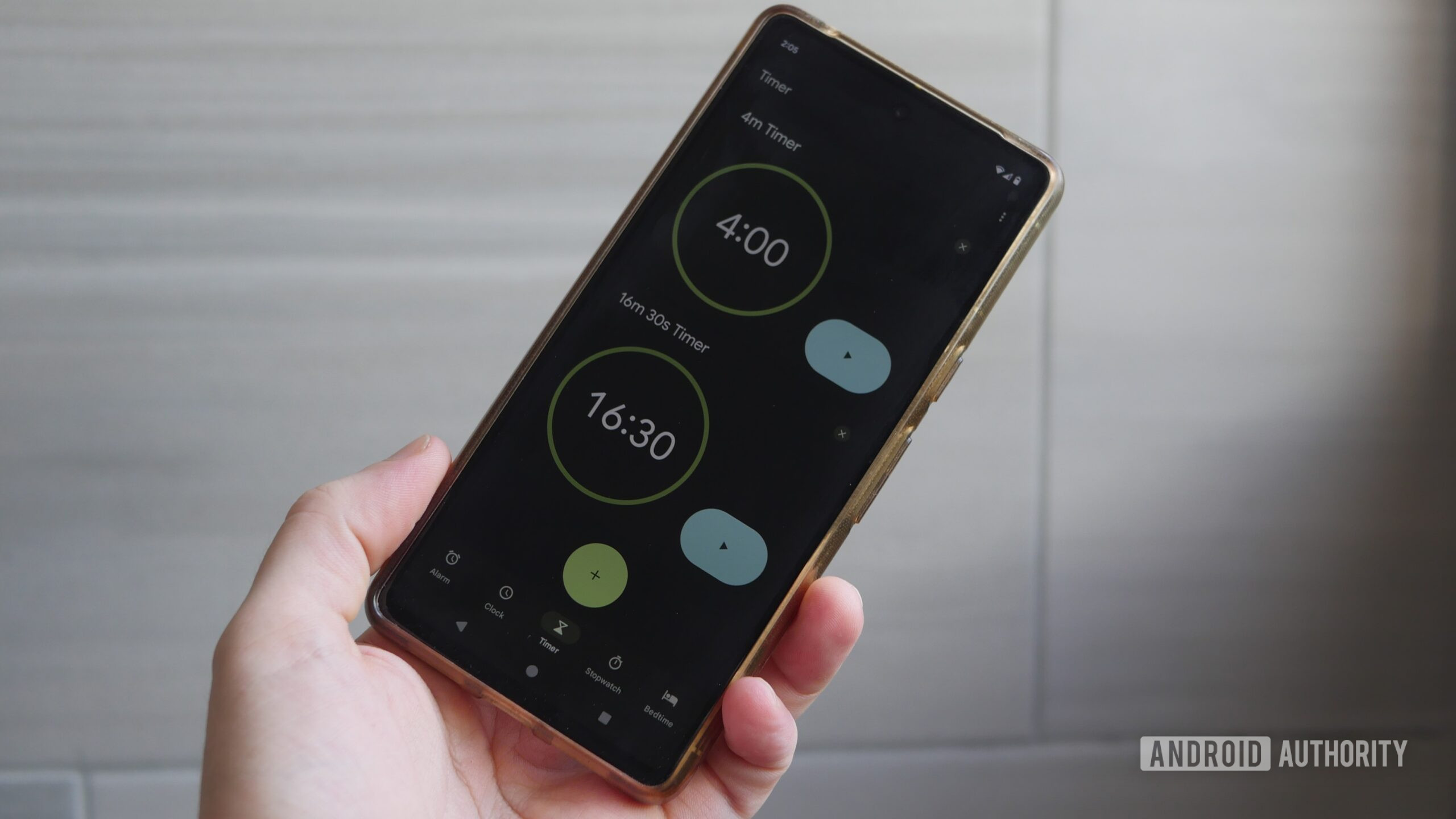
This horizontal movement of the numbers isn’t the only design gripe. A separate post from a Nothing user shows that the oversized new layout can no longer fit all controls on one page, forcing them to scroll slightly to see everything.

Part of the image posted by user Hia3 on the Google Support forum.
Meanwhile, on Google’s support forum, users reported the word “Stopwatch” being split in half because of the larger font sizing, with the “h” sitting on a second line. The only obvious fix appears to be shrinking the text system-wide.
Do you like the new Google Clock snooze button?
0 votes
Not everyone sees all of these issues, as they seem to depend on display size, font choice, and other settings. But that’s arguably part of the frustration — Google’s default apps should be robust enough to handle those scenarios smoothly. Instead, the Google Clock redesign feels half-baked, with complaints piling up just days after the rollout began.
For now, the only advice from Google’s support forum is to submit feedback and wait for a patch. Let us know in the comments if you’ve experienced similar issues.
Thank you for being part of our community. Read our Comment Policy before posting.

 By
By