Edgar Cervantes / Android Authority
TL;DR
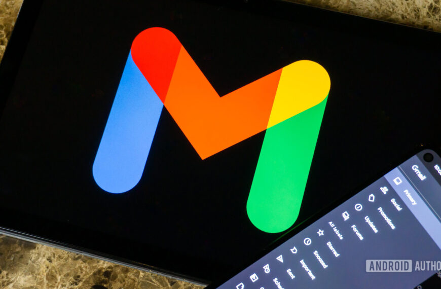
- Google’s currently updating its Android library with Material 3 Expressive design language.
- Following an initial look last month, we’ve spotted further signs of Files by Google’s M3E redesign.
- The app is experimenting with new, more intuitive icons and some revised screen layouts.
Who doesn’t love reinventing themselves with a new look for summer? When it comes to Google and its Android apps, right now that means gussying them up with a fresh dose of Material 3 Expressive design elements. While the company formally introduced that new look last month, and it’s still going to be a little while before we’re seeing it everywhere, we’ve already managed to spot early efforts to implement it across multiple Google apps. And today we’re adding a little more to that growing list.
An APK teardown helps predict features that may arrive on a service in the future based on work-in-progress code. However, it is possible that such predicted features may not make it to a public release.
This time around, Material 3 Expressive is freshening up the look of Google’s Files app for Android. If that sounds familiar, you’re not wrong, as we already spotted a whole lot of Expressive UI in progress when looking at Files last month. So while some of the screens here might reflect changes we already covered then, we’re also spotting further tweaks that are worth showing off.
We coaxed this preview out of version 1.7853.772781075.1-release of the app, but you won’t yet see these changes running it yourself. In all the image sets featured below, we have the existing layout on the left, and the in-development refresh on the right of each pair.
We’re starting out slow, and with these two, we’re mainly interested in what Files is doing with that Floating Action Button (FAB), condensing down to a single UI element and trying on that new pill-shaped look.
The app’s view for moving around files is testing some new iconography, swapping its line art for a filled-in look. We notice a refreshed layout for both list and grid views, one that Google seems to be moving to consistently across the app.
Here we’re again turning our attention to that FAB, with an improved design to better communicate new-folder functionality. Google is also trying out an icon refresh for the way the app indicates unknown file types, as you can see on the left.
Google’s working on a new view for file details, and the app could end up moving to the sidebar layout we have here. That can get a bit busy, granted, but we’d argue that things like the camera details are even easier to view with the sidebar UI.
We’ve also spotted some minor changes to font weighting in the app, but honestly, even with a side-by-side comparison the slightly bolder look Google is trying out is basically impossible to see — for now, just take our word for it. We’ll keep digging into Google’s future updates to Files and the rest of its Android library this summer in the hopes of uncovering more of this Material 3 Expressive progress.

 By
By