Ryan Haines / Android Authority
TL;DR
- A teardown of the Google app’s recent beta shows Gemini’s overlay UI may soon adopt Google’s brand colors.
- It replaces Gemini’s current two-tone colors with Google’s trademark red, blue, green, and yellow colors.
- The colors accent the mic button and highlight the chat box for interacting with Gemini.
Google has gradually refined how Gemini appears over the past few months. The assistant’s interface has become more polished, and more integrated, with features like the compact floating overlay and subtle animations. Now, Google appears to be testing another visual update, and it could make Gemini feel more like Google and less like a disembodied chatbot.
An APK teardown helps predict features that may arrive on a service in the future based on work-in-progress code. However, it is possible that such predicted features may not make it to a public release.
Digging into the new Google app 16.23.69.sa.arm64 beta release, we were able to get the app to give us an early look at a new visual treatment for Gemini’s overlay. Rather than the muted two-tone colors in the current iteration, this version swaps them out for Google’s brand palette of red, blue, green, and yellow.
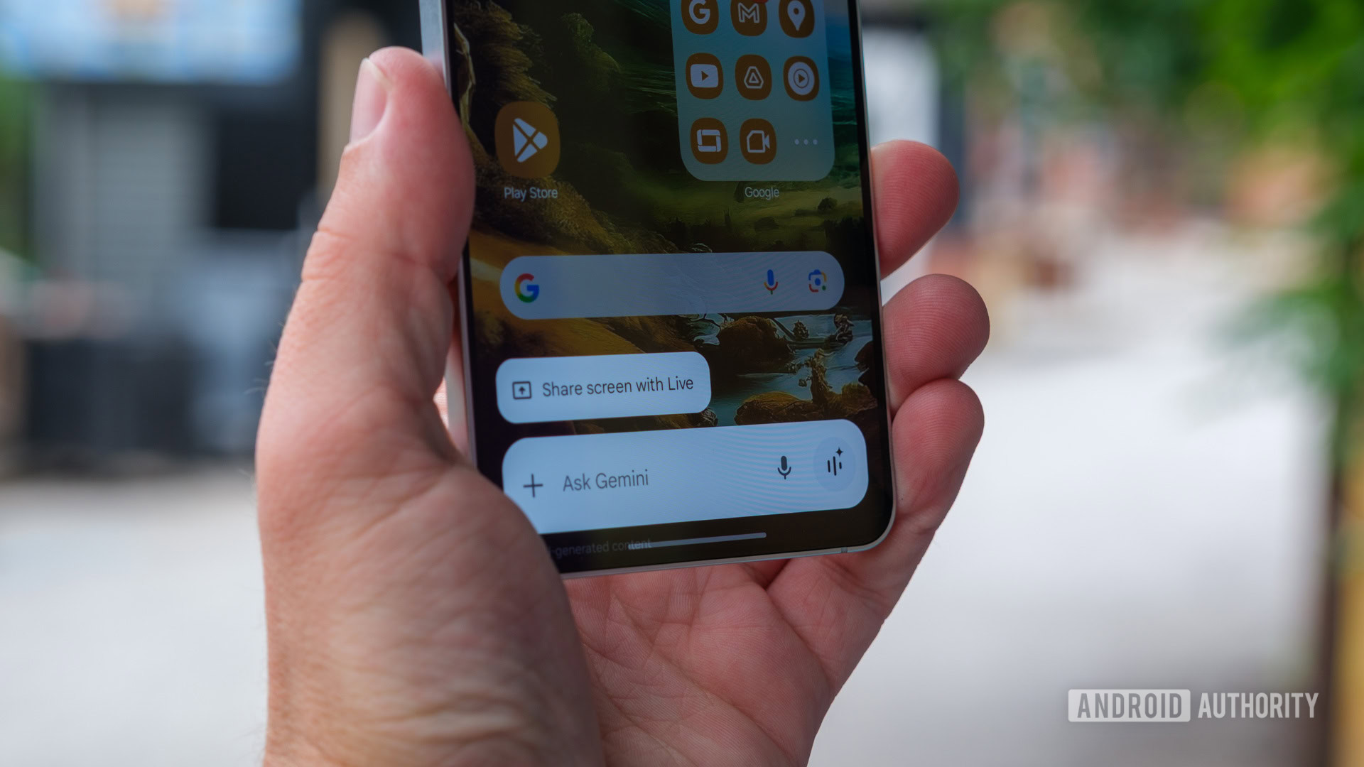
When you activate Gemini or use the Ask about screen feature, the overlay currently appears in muted colors that match the Gemini logo. These changes may soon show users a more vibrant UI, with colors framing the mic button, highlighting the interaction bar, and visually letting everyone know this is Google’s AI at work.
This update hints at more branding consolidation, a project Google has been working on for a while now. This helps bring more consistency across Google’s products. It is a visual reminder that you are using Google Gemini, not another AI tool. These changes aren’t live right now, and currently just seem to be something Google’s evaluating internally. However, if and when it ships, expect a more colorful Gemini experience.
