
Ryan Haines / Android Authority
TL;DR
- Our APK teardown of the Google app found that Google is testing several Gemini UI changes, including a new Discover tab.
- The Gemini sidebar may be getting a redesign, with a new layout and a settings shortcut.
- Gemini’s “Thinking” responses could be moved to a bottom sheet with additional model details.
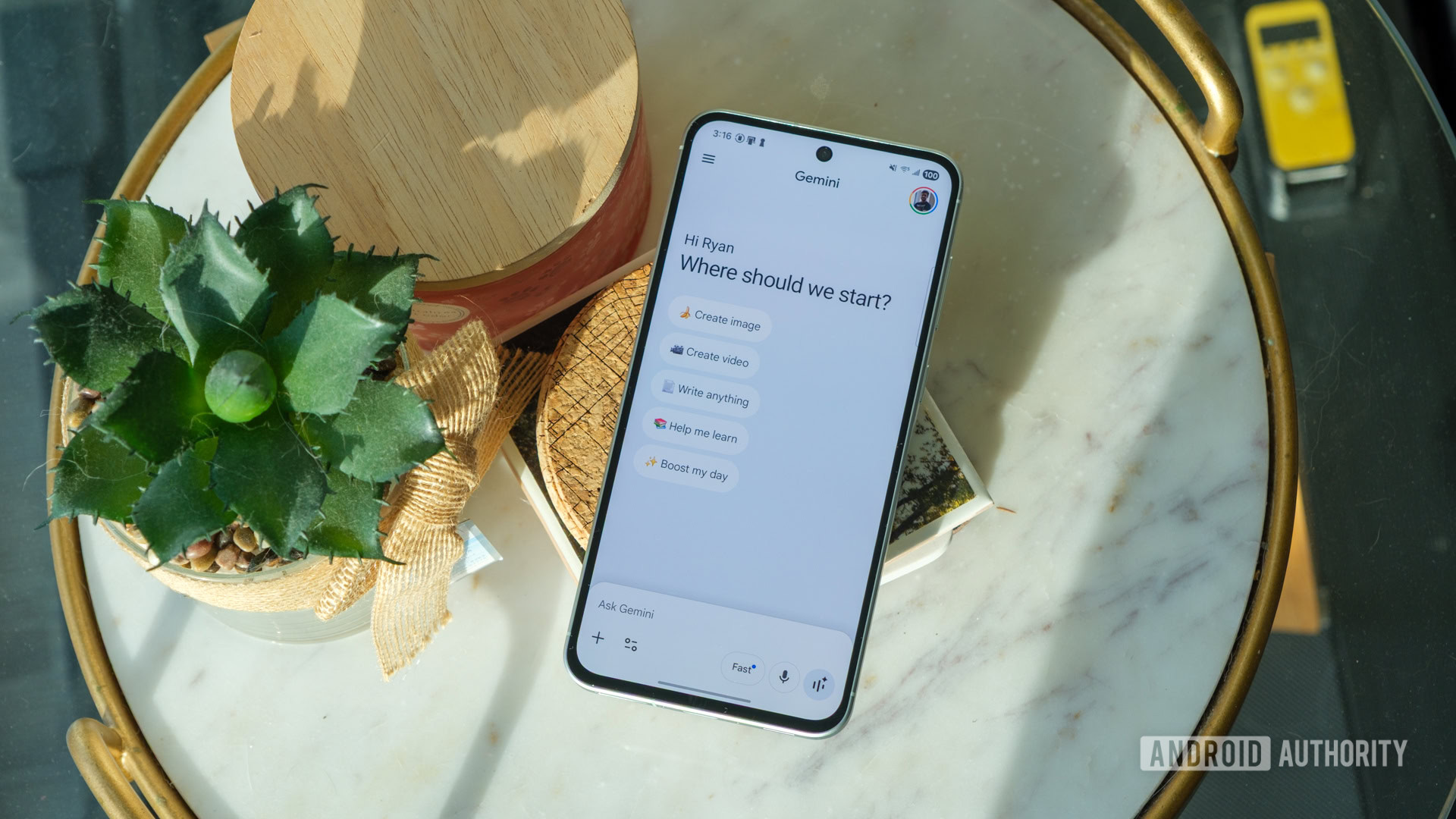
The Gemini UI seems to be an almost constant work-in-progress, especially in recent days. Just yesterday, we spotted a new way to branch conversations into separate chats being tested within the app, and it now looks like Google is also tinkering with how the app looks and feels, with several UI changes showing up in the latest beta.
While digging into version 17.10.54.sa.arm64 of the Google app, we were able to activate a handful of in-progress Gemini changes. None of these are live yet, and some are clearly unfinished, but they offer a look at where the interface could be heading.
One of the more intriguing additions is a new “Discover” option in the Gemini sidebar. Right now, Gemini’s sidebar is mostly focused on navigation, letting you jump between chats and access core sections of the app. The new Discover entry appears alongside those options, but tapping it currently leads to an empty page. That makes it hard to pin down exactly what Google has planned here, though the name suggests it could surface things like featured prompts or ways to explore what Gemini can do. It’s basically just a placeholder for now, but you can see it in the images below.
Google also seems to be experimenting with changes to the Gemini sidebar UI, although things are a bit messy at this stage. In its current form, the sidebar is fairly simple, with your chat history and a few navigation options. One version we enabled looked very similar to the existing layout but failed to load chats altogether, suggesting it’s not fully wired up yet.
Don’t want to miss the best from Android Authority?
However, another variant does appear to be further along, successfully loading chats while introducing subtle UI tweaks. This version adds a dedicated settings option at the bottom — something already seen in Gemini’s web interface — hinting that Google may be working toward a more unified design across platforms. You can see what we found in the images below.
We’re also seeing further tweaks to the Gemini overlay, building on changes we previously reported. Earlier versions pointed to a shift toward separating the input box and responses into distinct sections. This new iteration keeps that general direction but adjusts the controls around it. There’s now a prominent close button in the top-right corner above the overlay, while the voice output button has been repositioned to the bottom-right. Other actions, like rating or sharing responses, still appear at the end of Gemini’s answers.
Finally, there’s a small but interesting update to how Gemini handles its “Thinking” responses. Currently, when Gemini shows its reasoning, you can expand it in-line above the answer. In the newer UI, tapping “Show thinking” opens that content in a bottom sheet instead. This separates the reasoning from the main response more clearly, and it also includes additional details like the model used. It’s a subtle shift, but one that could make longer explanations easier to navigate.
As with most APK teardown findings, there’s no guarantee that any of these changes will make it to a public release. Still, we’ll be keeping an eye on the work-in-progress examples in future versions, especially the Discover option. Watch this space.
⚠️ An APK teardown helps predict features that may arrive on a service in the future based on work-in-progress code. However, it is possible that such predicted features may not make it to a public release.
Thank you for being part of our community. Read our Comment Policy before posting.

 By
By