
Joe Maring / Android Authority
TL;DR
- Google Photos is ditching the classic bottom navigation bar in favor of a floating toolbar.
- The new pill-shaped toolbar floats above your images and combines Photos, Collections, and Create in one compact bar.
- The update is live on iOS (version 7.63) for now, with no confirmed timeline for Android.
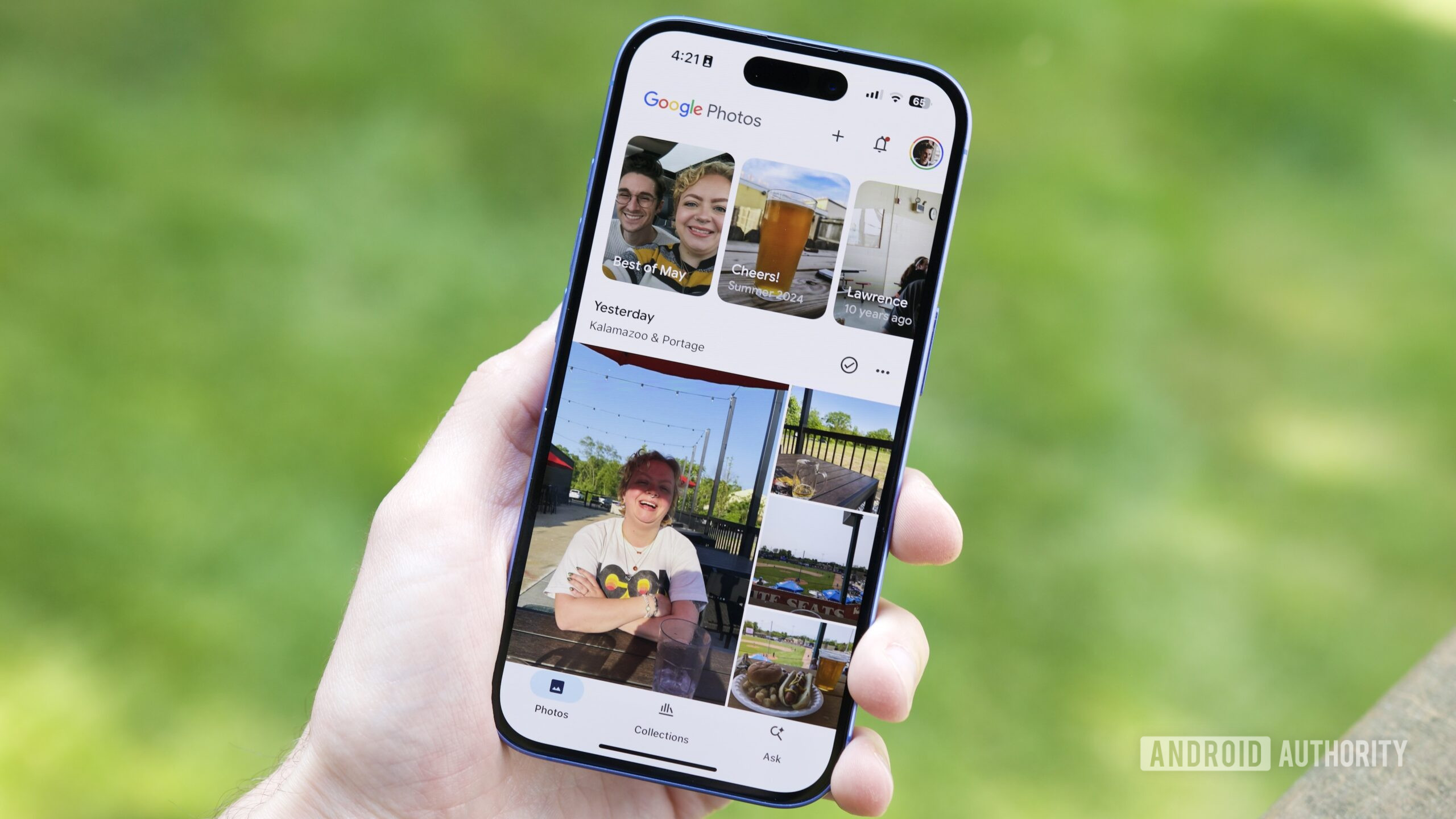
Google is updating one of its most popular apps with a new user interface that’s both a departure and a refinement. After years of using the standard bottom navigation bar, Google Photos is switching to a floating toolbar design starting on iOS, and the change already looks more content-friendly.
For context, most of Google’s Android apps have already migrated to a shorter bottom bar or similar navigation system as part of the broader Material 3 Expressive design language rollout. But Photos had been the holdout — until now.
Don’t want to miss the best from Android Authority?
As spotted by 9to5Google, the search giant is rolling out a pill-shaped floating toolbar that hovers above your photos. It groups tabs like Photos, Collections, and Create in a single bar, and adds a floating action button (FAB) on the right for Search or Ask.

Adamya Sharma / Android Authority
This update is more than just a visual change. Since the toolbar stays visible while you scroll and sits higher on the screen, you can actually see more of your pictures without the UI getting in the way.
The floating toolbar aligns with a design direction we’re seeing across Google apps that already lean into similar laid-back toolbar logic, where actions relevant to the screen you’re on float nearby instead of being locked at the bottom.
Currently, Google is only showing this new toolbar on iOS versions of Photos (version 7.63). This could mean a similar update is coming to Android soon, but there is no clear timeline yet.
Thank you for being part of our community. Read our Comment Policy before posting.
 By
By