
Joe Maring / Android Authority
TL;DR
- Google is expanding its testing for a redesign of the Wallet app.
- We’ve now spotted a new, colorful interface for passes.
- The interface now also shows more details on the same page, though it looks far from complete.
Previously, when we discovered the redesign, we found that the changes to Google Wallet’s home screen centered on favorite passes. Now, we’re seeing the changes Google intends to bring to individual screens dedicated to each pass added to Wallet. We’ve noticed these changes being tested with version 26.12.886012413 of the Wallet app, though they haven’t reached the wider user base yet.
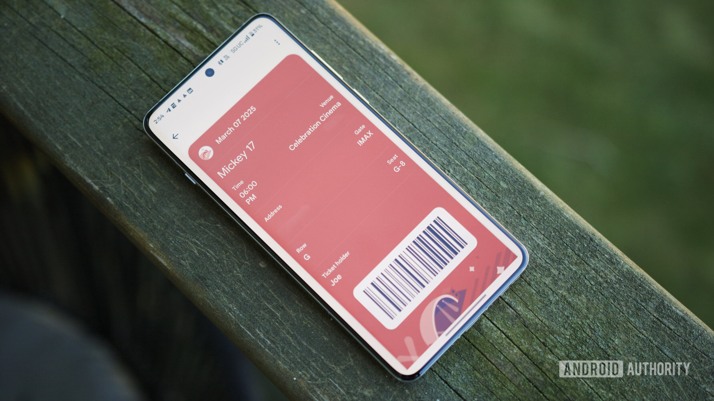
From the level of details to new aesthetics, the pass page appears significantly redone. With the redesigned interface, we now see more details on the first page when we open each pass. This includes the ID name, number, the date it was added, and shortcuts to settings related to the pass. In the existing interface, these details can only be accessed by tapping the three-dot button at the top-right corner of the pass details page.
Another addition we see is a new star icon denoting that the pass is included in your favorites.
Additionally, there are some stark visual changes, too. For starters, the pass graphic now occupies a larger area in the top half. The dominant color from this graphic is also used for the background behind the text boxes. There’s a clear Material 3 Expressive influence, though the inconsistent shapes of these text boxes suggest the interface isn’t ready yet.
Don’t want to miss the best from Android Authority?
The three-dot button has been replaced with a launch icon, which when tapped opens a page similar to the existing interface. It’s not quite clear whether that is how Google intends it to be, or if it is because of the incompleteness.
Similarly, we see the colorful cards throughout other passes, including movie tickets or even Google Play Points tally. However, given the lack of uniformity in design, it’s difficult to predict when it might actually be implemented. We’ll ensure letting you know when we see that happening.
⚠️ An APK teardown helps predict features that may arrive on a service in the future based on work-in-progress code. However, it is possible that such predicted features may not make it to a public release.
Thank you for being part of our community. Read our Comment Policy before posting.
 By
By