
I finished my review of last year’s Nothing Phone 3 in a weird place. As much as I like Nothing OS and much of what Nothing did with its trio of cameras, I struggled to get behind the revamped design and felt like the Glyph Matrix was dead on arrival. And yes, Nothing has worked hard since then to at least make the latter more useful, but you just can’t fix a flawed design.
So, you better believe I’m thrilled with the first look at the new Nothing Phone 4a. It’s both a step forward and a throwback to a better era in terms of design, and I think it fixes everything that was wrong with the Phone 3. Here’s why.
What do you think about the Nothing Phone 4a design?
0 votes
A normal camera bump means normal phone cases, thank goodness
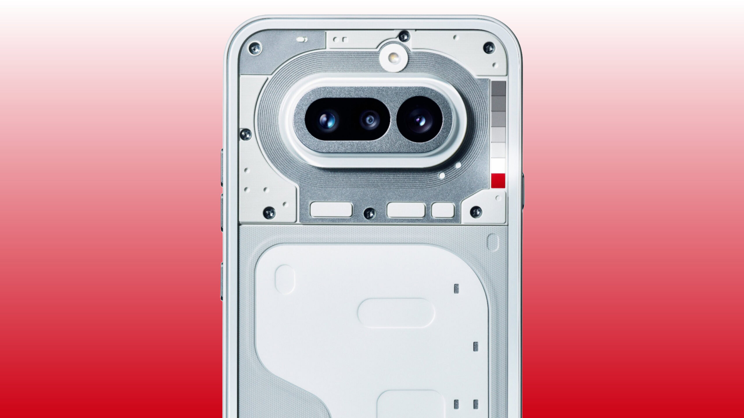
If you’ve ever held — or even seen — the back of the Nothing Phone 3, you probably know where I’m coming from. At a glance, and I mean a glance, it looks neat. It certainly won’t be confused for a Pixel, an iPhone, or anything else. None of the cameras touch, and the Glyph Matrix is in a totally new spot. The thing is, though, that design made it impossible to find reliable Nothing Phone 3 cases at launch.
Now, several months later, the options have improved. Ringke and Spigen both offer a few designs, but there’s still no first-party design for the Nothing Phone 3. Instead, the company would rather you buy its hoodie or overalls — you know, to protect yourself instead of your phone, I guess. And sure, I get it, the design of the Phone 3 is complicated… but wouldn’t you think that makes repairing such a phone complicated, too?

So, now that the covers of the Nothing Phone 4a have been pulled back, I’m breathing a sigh of relief. I never thought I’d be so excited to see a pill-shaped camera bump ever again. It reminds me of a recent Pixel (albeit smaller) or a Galaxy S10, and I know that there are plenty of cases for those. I don’t necessarily expect Nothing’s latest budget phone to get quite the same number of options as one of those flagships, but the simplified design should mean at least a handful of fun cases to choose from.
Who knew a normal design would lead to more phone cases? Well, everyone.
And yes, I know that Nothing once again changing its light-up design complicates things, but I think the Glyph Bar will be another improvement. It’s closer to the look of the Glyph Interface — a series of lights rather than a Tamagotchi-like display — meaning prospective case designers won’t have to worry about cutting a hole in their creations for the Glyph button or whatever Nothing decided to call its control.
I, of course, don’t love that a newly redesigned Glyph Bar means the case designers will have to go back to the drawing board, but I think the solution this time is much easier. I’d guess a simple transparent section or even a cutout would do the trick for showing off the light-up interface without compromising protection. If they could do it for Apple’s Camera Control, they can certainly do it here.
Less interaction with the Glyph Bar means I’ll use it way more

Ryan Haines / Android Authority
My bigger issue with the Glyph Matrix — much more than simply making cases difficult — is that I barely use it. I know Nothing added it with lofty goals of having a quick interface that you can check instead of opening your phone, but I find that the Glyph Matrix rarely provides enough context. Sure, it’s good for checking the status of your phone charging or seeing if your Uber is almost here as it progresses across the circular array of LEDs, but that’s about it.
If that were all that Nothing intended for its Glyph Matrix to do, I’d probably be okay with it. Technically, the older Glyph Interface did roughly the same thing, showing task progress along its LED bars, but in a less obtrusive way. But when you have a circle of hundreds of little lights, and you’re only really using a strip of them in the middle, it’s hard not to feel disappointed. I mean, I’ve never looked at my phone and wished I could play spin the bottle on the back of it, but the Nothing Phone 3 makes that a reality, I guess.
A simple Glyph experience is a useful one, no games or toys required.
So, while I don’t yet know how the Glyph Bar will work, I have to think it will be an improvement. It’ll, at the very least, simplify the process for my notifications and other apps, which is what I loved in the first place. Maybe it’ll bring back the Glyph Composer functionality, perhaps it’ll use what looks like a red LED as a recording indicator, or maybe it’ll just light up to the beat of my ringtone — I’ll take all of it if it means I can use my phone less.
The thing is, though, all of this still makes me nervous. I’m not sure that I can trust Nothing to stick with whatever iteration of the Glyph lights it makes next. It’s just going to keep refreshing things, adding things like Glyph Toys while stripping back the Glyph Composer, and I fear that the Nothing community will get tired of the constant change when they can only flex their creativity for certain users. For now, though, I’ll stay optimistic and hope for the best out of yet another design refresh.
Don’t want to miss the best from Android Authority?
Thank you for being part of our community. Read our Comment Policy before posting.
 By
By