
Adamya Sharma / Android Authority
TL;DR
- YouTube Music is getting a redesigned Now Playing interface.
- Google has replaced the Song/Video toggle with icons and moved some things around, so you’ll have to relearn how to use the screen again.
YouTube Music is getting yet another Now Playing redesign, bringing a split-screen view, new placement for some features, and more.
Don’t want to miss the best from Android Authority?
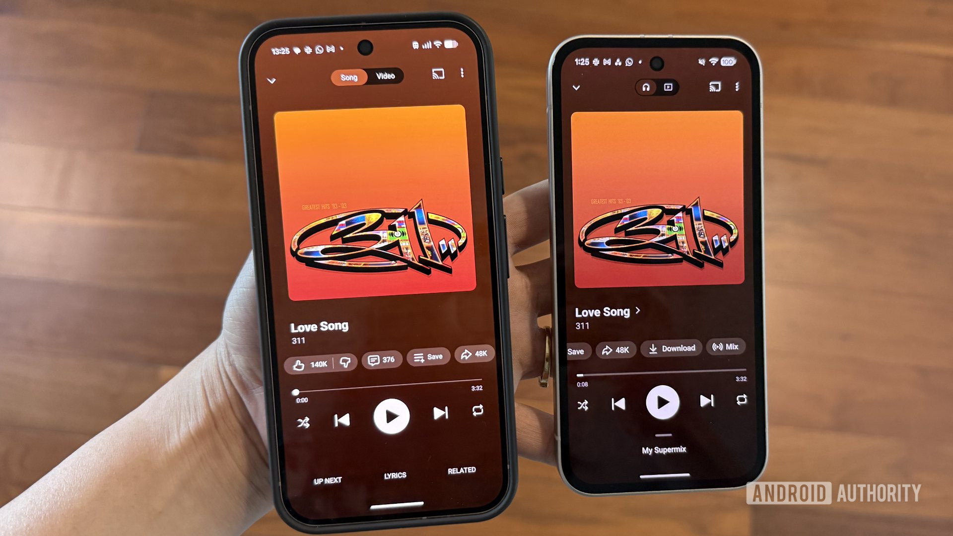
The most prominent change is visible at the top of the player. The Song/Video toggle is now much smaller and uses representative icons instead of text.
Another big change can be spotted at the bottom of the screen. The “Lyrics” and “Related” tabs are no longer shown there. Instead, this space is now used for your Up Next queue.
You can swipe up anywhere on the player to bring up this queue in a half-screen view. Swiping down again will take you back to the full-screen player layout.
If you want Lyrics, you can now find them just next to the like/dislike button. The Related section is tucked behind the song title menu, so you can tap the title and the arrow icon next to it to access recommended playlists, related tracks, similar artists, and more.
Meanwhile, the main playback controls and button carousel are still in the same place, but you’ll notice that the progress bar is now slightly thicker. It also intuitively expands further when you tap or drag it.
The update now appears to be rolling out widely on Android with version 9.14 of the YouTube Music app as well as on iOS. I had to force-stop the app once for the redesign to appear. You might also have to do the same since this is a server-side change.
Thank you for being part of our community. Read our Comment Policy before posting.
 By
By